In a former life, I worked for a music company and we struggled with a difficult question on our websites: When creating an email signup form, how much can you ask for (i.e., is there a magic number of fields you can request before someone abandons)?
It's not difficult technically, because frankly you can load up your form with as many questions as you can find space.
It's more difficult philosophically because there's a strong aversion to asking for too much up front (to use an overly cliched analogy, you can't ask for a marriage proposal when you're only considering a first date), but still needing enough to run a segmentable marketing campaign.
We settled out with the basics: first name, last name, zip/postcode, and email address. We did ask for gender and mobile number for a few key sites as optional data, but our general rule was the less on the page, the better. To be honest, we never set up any A/B testing to validate the theory, but it's a safe bet that four fields looks much less intimidating than a full page you have to scroll through.
This approach gives you some very basic info that you can use to segment your message (if an artist will be on tour in NY, does anyone care who lives in Ohio?). Our segmentation needs were not tremendous, but the zip code was definitely key, and having a first name enabled us to do some basic personalization.
Quick aside: Never, never go the route I've seen some companies where they'll use your name in the subject line like "SETH, CHECK OUT THIS FABULOUS DEAL." I'd love to see the open rate results for a hideous campaign like this!
Recently Anne Holland over at MarketingSherpa posted a great story touching on the three email signups for the current candidates. Check out the images below and what subtle (or not so subtle) messages they're sending:
Please note, I had to use an earlier version of Obama's signup form; after viewing once every repeat visit to the site would skip this page and take me straight to the main website
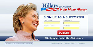
Hillary: "I'm having a really good time with this."
Thoughts: Intentionally or not, her image is looking in the direction of the info, implying that she's interested and aware of the people that are signing up. Top marks for going for first name, last name, email, and zip. Design is clean, submit button stands out, and she's also provided a means to skip the form and go straight to the website.
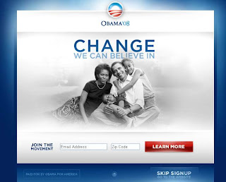
Obama:"I'm a family guy, I love what I do, and I'm ready and willing to show you more."
Surrounded by family, he's showing that it takes more than a candidate to pull off change. The button for submission is not "Submit" but a softer "Learn More". He's only opting in for email and zip, presumably because his team will use this information to start building your profile and will build on that consumer record through the various community aspects of his site that BarakObama.com offers. 
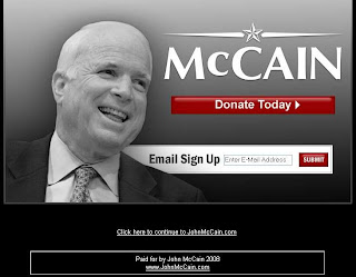
McCain:"In addition to running for President, I'm also starring in a remake of Citizen Kane!"
The black and white image screams newspaper mogul from the turn of the last century, not someone who's in touch with today's world. And the biggest thing that stands out on this page? One giant red "Donate Today" button. Doesn't look for zip code, so no presumed intelligence behind the scenes with this data, just give me your email so I can add it to our list of thousands.
MarketingSherpa declares Hillary the winner, but I have to disagree and say that Obama's sends a much stronger emotional message (given that he's surrounded by family and is not striking it out on his own). But what really clinched it for me was that this design has grown over time, presumably based on feedback from the public at large.
Today I came across a another blog post from Bivings Report where the author criticized an earlier Obama email signup form that did NOT offer a way to bypass the registration and go straight to the site.
This is not the case with today's form, so someone in Obama's camp was either listening to the blogosphere or testing their site and found break points like this, then took action to make the necessary changes.
And in my book, if you're listening to feedback out there and committed to taking action accordingly, you're in the winning camp.
What does this mean for other businesses?
1) There's a fine line between asking for too little and too much from an email registration form, but if you're really planning to do anything meaningful with the data, you're going to need to grab a zip code at the bare minimum.
2) When designing your registration form, you want to make it easy and to have certain actions stand out, but adding a giant red "Give Money" button on your site skews your message to be more about money and less about building a relationship with a prospective customer.
3) Make it look fun! So many forms out there on the web are mind-numbing (ever been to a health care site to set up a user profile?), so take the time and do something to make it look half-way exciting. At least you can say all three candidates are smiling!
Wednesday, April 2, 2008
Clinton, Obama, and McCain to the Rest of Us: We Want Your Email Address!
Subscribe to:
Post Comments (Atom)
2 comments:
What an interesting post, Seth! With so many of our communities moving online, and so many websites asking for personal information, this is a very timely topic. Great comments on all the candidates pages, although I would have to agree with MarketingSherpa that Hillary Clinton's is the one I find the most attractive and welcoming.
Thanks for the thoughts, keep 'em coming!
Jenni,
Thanks for the comments and the voting on the article. I've always found these kind of exercises a great case of art mixed with science; at least we can say with all three that they're definitely pushing to add a personal stamp on each form and not bore us to tears as so many website registration forms often do.
Regards,
Seth
Post a Comment